Restyling Box

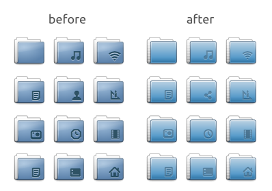
Arriving to version 0.43, we found the inspiration (or the need) to revisit the current icon theme. Just a few retouches here and there, a lot of (colour) improvements and (grid) adjustments, returned a refreshed air on all folders and related glyphs, and an overall smoothing look. Now the theme is a bit more sharp than before, and sure more clear for reading in small and big screens. Here’s the sample:
Also, if you use any dock (docky, plank, or you just use a huge lxPanel) you’ll notice the completed new sizes. If you have installed Lubuntu 13.10 don’t worry, updates will arrive in a few weeks.

